LOGO DESIGN
BWT Physiotherapy
BWT came to Hello Ivy wanting a new logo design
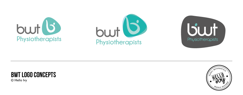
The font was kept simple and rounded to symbolise flexibility. The logo incorporated a shape to represent a vertebrae. This included a ‘b’ within the shape of a person stretching to touch their toes
Relaxing blue/green tones were used with a bold charcoal
Logo Design
STYLE
Contemporary & simplistic
CONCEPT
Flowing, flexible logo design with a relaxing colour palette


