


BRANDING
PURE SPA
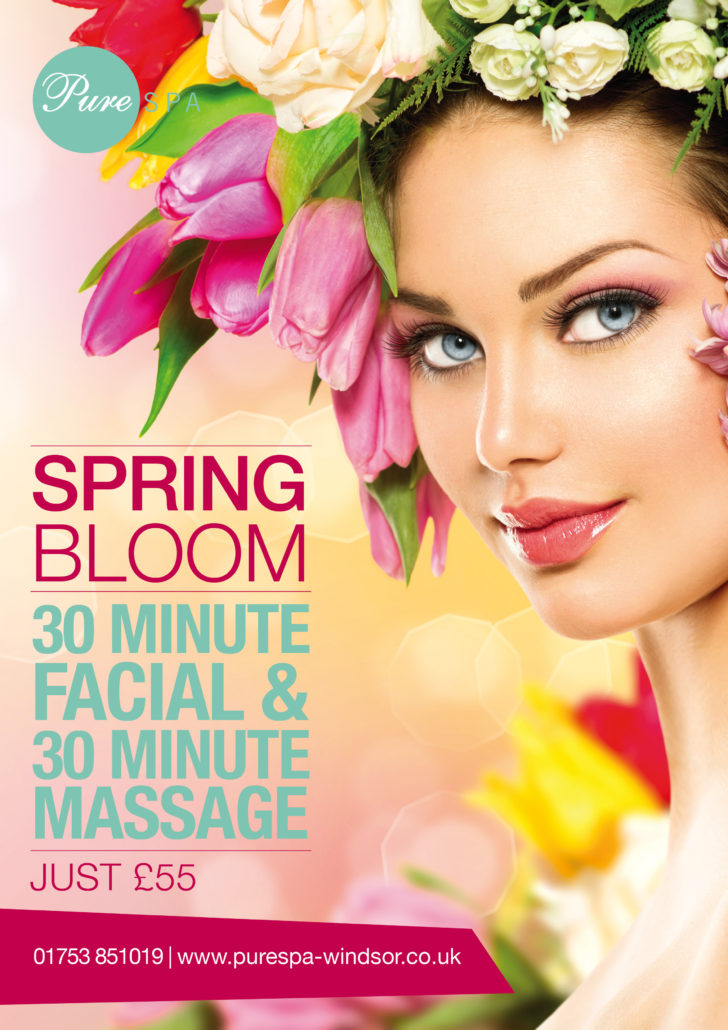
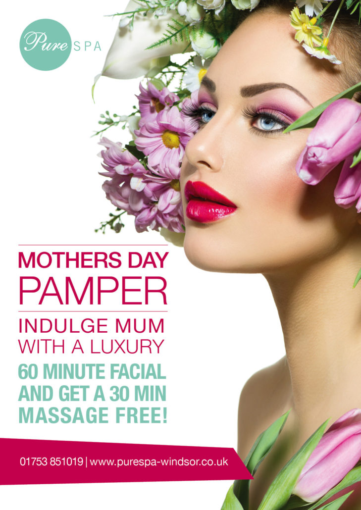
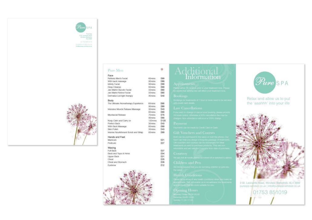
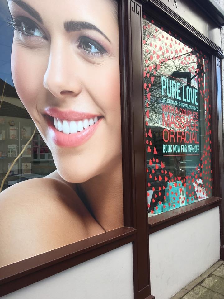
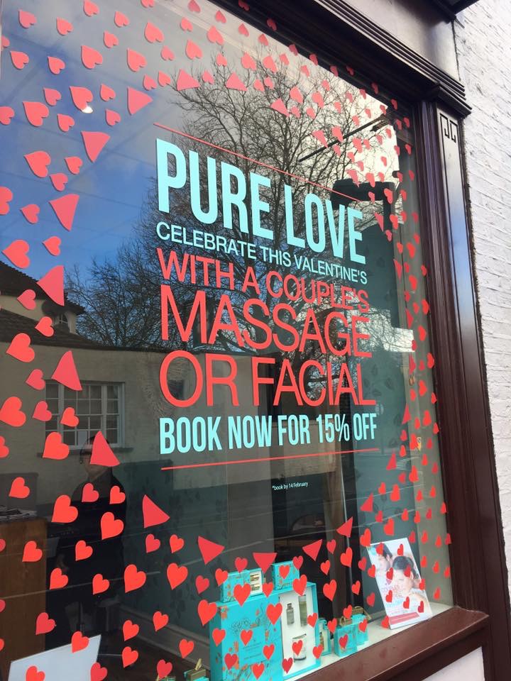
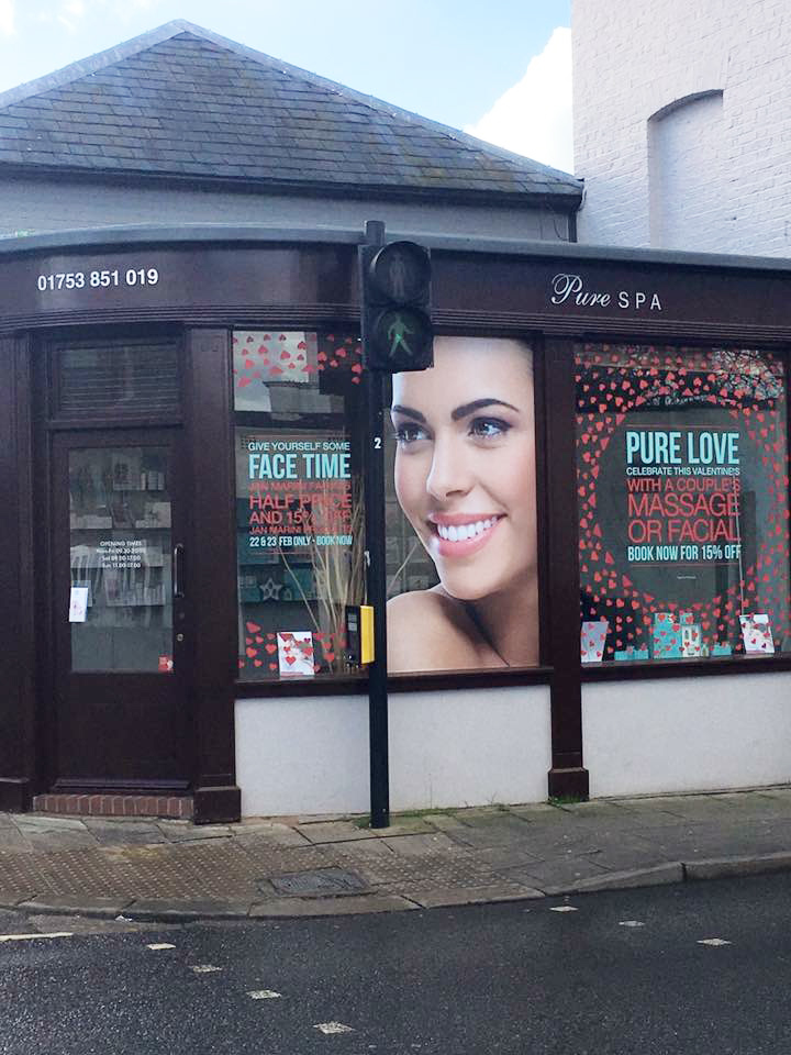
Windsor based beauty salon Pure Spa needed branding to draw attention. The salon is in the town centre but close to a road, so they needed posters and displays which would catch not only the eye of walkers by by people driving past
The typography is kept simple using a combination of sans serif typefaces in two weights. The peppermint green continues through all their marketing materials and the striking red is used on all their window displays and posters
The style is clean, fresh and striking
Designs included – price lists, letter head paper, compliment slips, posters, social media graphics and window wraps
Branding
STYLE
Clean, fresh and striking
CONCEPT
Eye catching, contemporary and must stand out

